Typistry
Interactive type specimen platform
Reimagining the type specimen book for mobile learning
Role
Product Designer
Timeline
3 weeks, Fall 2025
Tools
Figma
Team
Sole Designer
AT A GLANCE
I defined and designed a mobile-first interactive type specimen platform from concept to prototype
01 Problem Reframing
Reframed the brief from “displaying a typeface” to “helping users learn and engage with typography,” identifying an opportunity to transform a traditional specimen book into an interactive, educational experience.
02 UX & UI Systems
Designed the end-to-end UX and UI system for a mobile-first platform, defining information architecture, typographic hierarchy, and reusable components built on strict grid and accessibility principles.
Context
Typistry is a mobile-first interactive type specimen platform designed to help designers explore, understand, and apply typography through interaction rather than static reference. Developed as part of a Communication Design Studio course, the project builds on earlier work in print hierarchy and kinetic typography. By reframing the traditional specimen book as a learning tool, Typistry emphasizes interaction, motion, and feedback to make typographic concepts more approachable and intuitive.
I worked as the sole designer, leading the project well beyond the original assignment scope. In addition to meeting core requirements, I reframed the problem space, expanded the concept into a cohesive product vision, and designed both mobile and web experiences to explore how typographic learning scales across contexts. My work spanned research and problem definition, UX strategy, visual design, system and component building, accessibility considerations, and high-fidelity prototyping. Throughout the process, I focused on translating typographic knowledge into a clear, human-centered digital system that balances education, usability, and visual craft.
01 Problem Framing
Rethinking the brief
Why Design a Type Specimen for Mobile?
The original assignment brief tasked students with designing a mobile type specimen app in Figma that translates typographic hierarchy, motion, and interaction design principles into an exploratory learning experience. The project’s initial goal was to reinforce mobile UI fundamentals in Figma, but with that foundation already in place, I pushed beyond the baseline to question the product’s purpose. Many strong type specimen tools already exist on the web, raising a key challenge: why design a type specimen for mobile when fonts aren’t typically downloaded on phones?
Reframed Design Prompt
How might we reimagine the traditional type specimen book as a mobile-first experience that helps users learn, notice, and engage with typography through interaction rather than static reference?
02 Solution
Redefining the Type Specimen as a Learning Tool
01 Establishing Intent
An opening animation and guided introduction that reframes the type specimen as an interactive learning experience, setting expectations through motion and exploration.
02 Integrated Learning System
Micro-lessons embedded across the app, guiding users through core typographic concepts via short, readily available explanations
03 Community-Driven Knowledge Layer
A centralized forum combining expert insights, peer Q&A, and curated content to support continuous learning.
04 Structured Typeface Discovery
Search and filter tools for browsing, refining, and saving typefaces.
05 Core Type Specimen, Integrated.
The primary focus of the assignment, designed as an interactive specimen and embedded seamlessly within a broader learning system.
06 Desktop as Platform Extension
A scalable web experience designed for advanced comparison, structured browsing, and asset access.
03 Process
Research, synthesize, visualize, prototyope.
Design Process
01 Research & Discovery
Receiving brief → understanding constraints and goalsUser research
Reframing brief → defining opportunity and hypothesis
Competitor/market analysis
Insights synthesis → defining pain points and needs
02 Ideation
General wireframing → low-fidelity sketches, flow diagrams
Information architecture → sitemap, navigation logic
User flows → mapping interactions and decision points
03 Visual Design & Branding
Branding/styling → color palette, typography, iconography, grid
Moodboards → tone exploration
Style guide → component states and tokens
Accessibility check → contrast, hierarchy, text size
04 Prototyping & Interaction Design
Hi-fi prototyping → realistic mockups with UI fidelity
Adding interactivity → transitions, animations, microinteractions
Usability testing → observe user flow comprehension
Iteration → refine based on testing insights
01 Research & Discovery
Competitve analysis
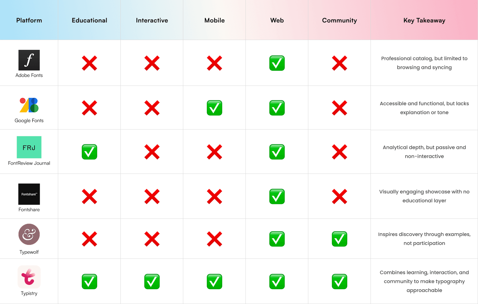
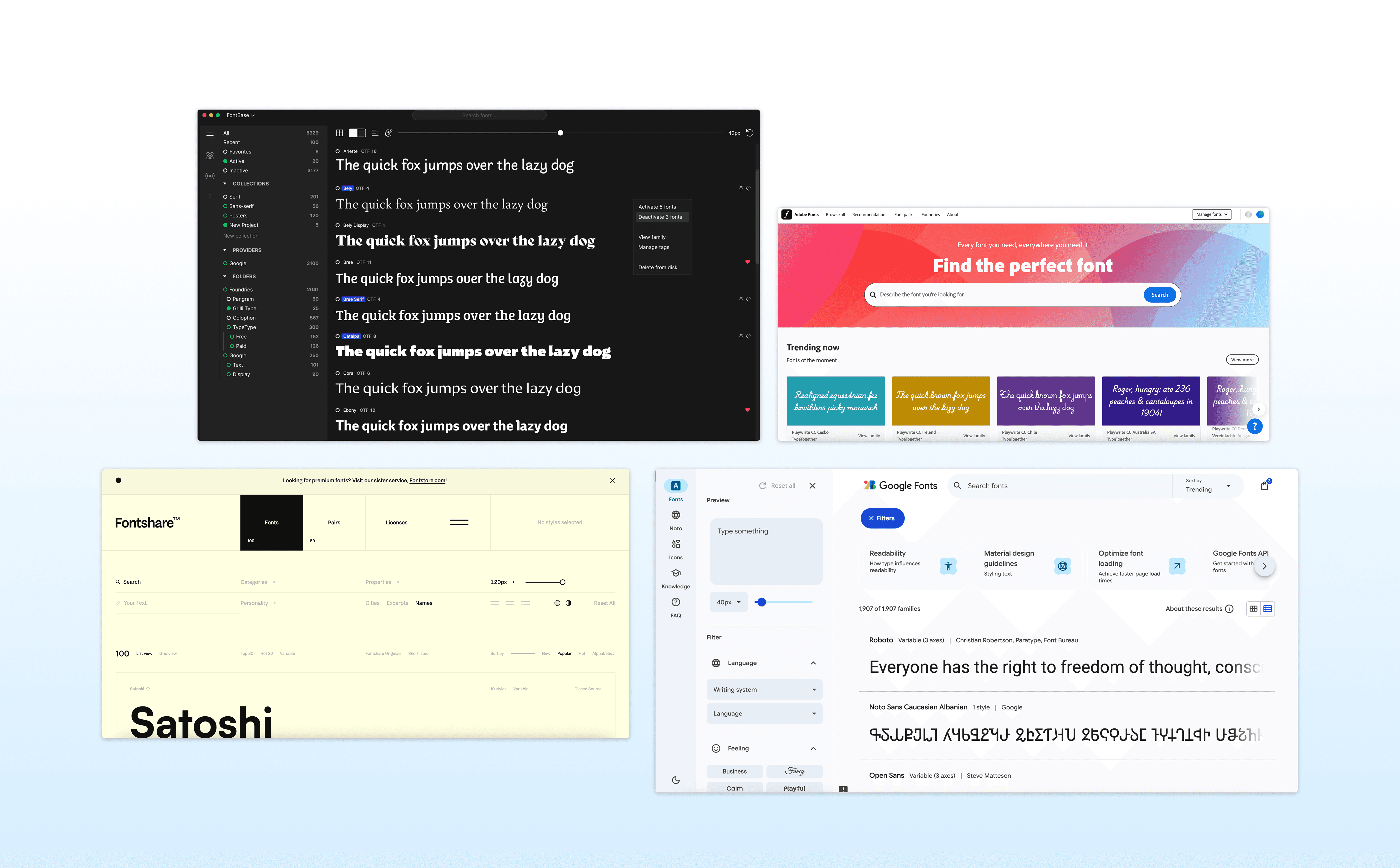
I conducted a comparative study of existing type specimen tools, educational apps, and design resources, such as Google Fonts, FontReview Journal, and Fontshare, to identify what was missing. While many platforms excelled in visual display, few offered interactive learning or community integration. This highlighted a gap between passive presentation and active understanding through learning and interaction.
User persona

Design Learner
a student or hobbyist interested in understanding type anatomy and pairing

Creative Practitioner
a designer seeking quick reference and inspiration in real-world contexts
Key Design Insights
01 Approachability
Reduce intimidation around typographic terminology.
02 Interactivity as Learning
Replace static explanation with visual, motion-based feedback.
03 Visual Consistency
Allow typography to remain the focus while maintaining UI clarity.
02 Ideation
System Architecture
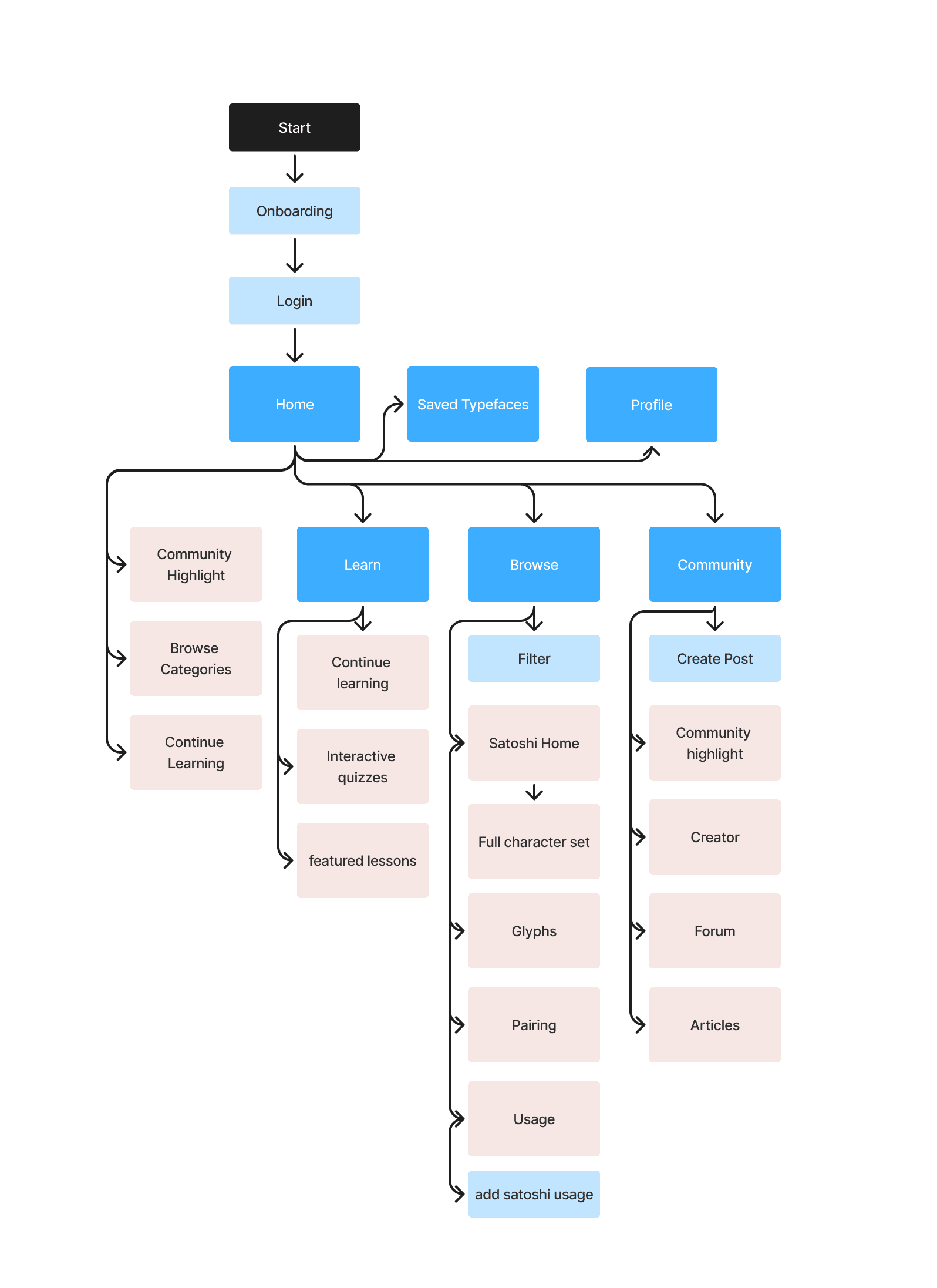
This visual mapping helped clarify the app’s information hierarchy and relationships among screens, ensuring a balance between educational content and typographic exploration.
Wireframing

Early wireframes and visual explorations were used to map the app’s core screens, flows, and typographic components. By laying out key surfaces, I clarified the information hierarchy and relationships across the experience
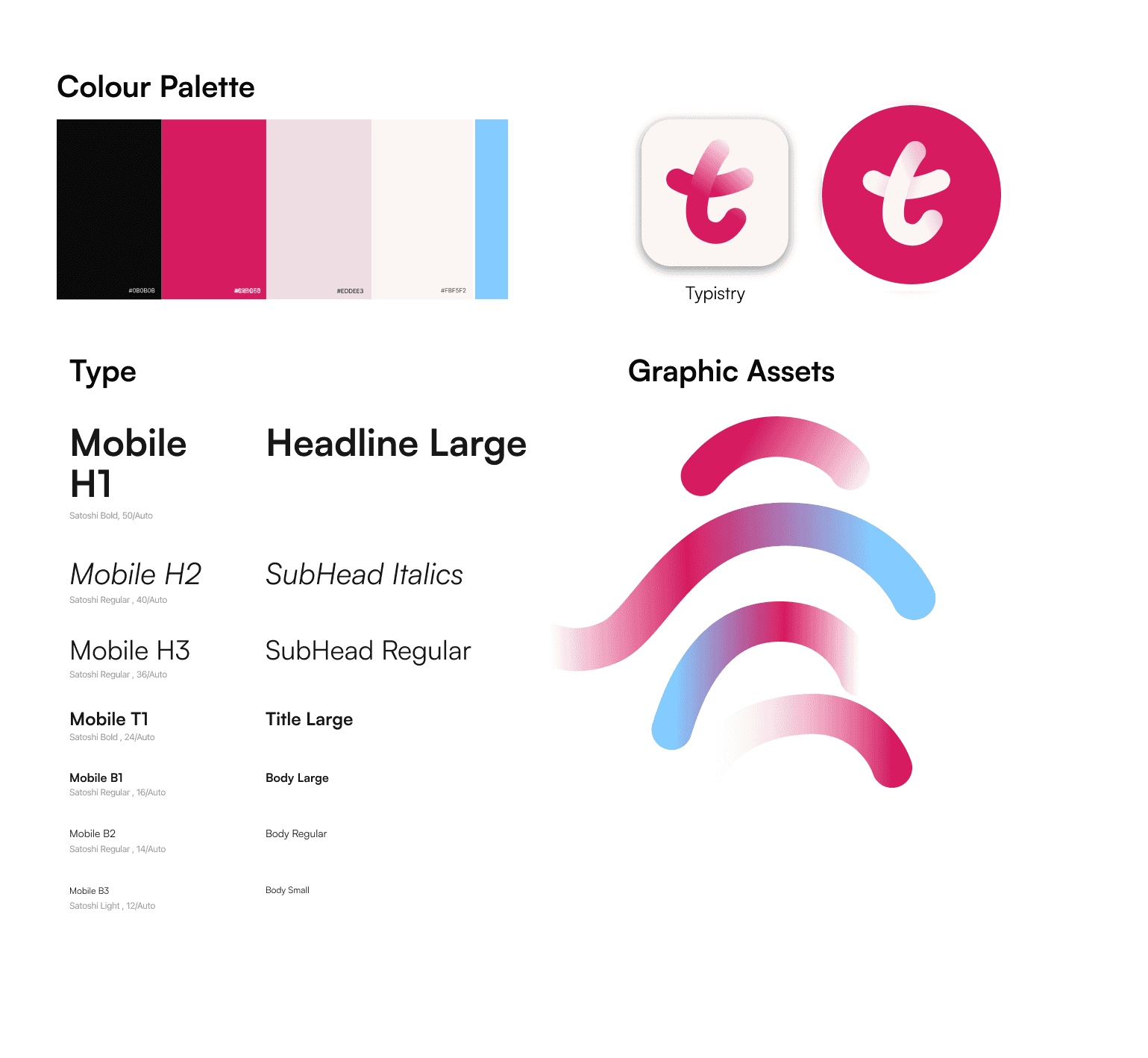
03 Visual Design/ Branding
Brand System + Components
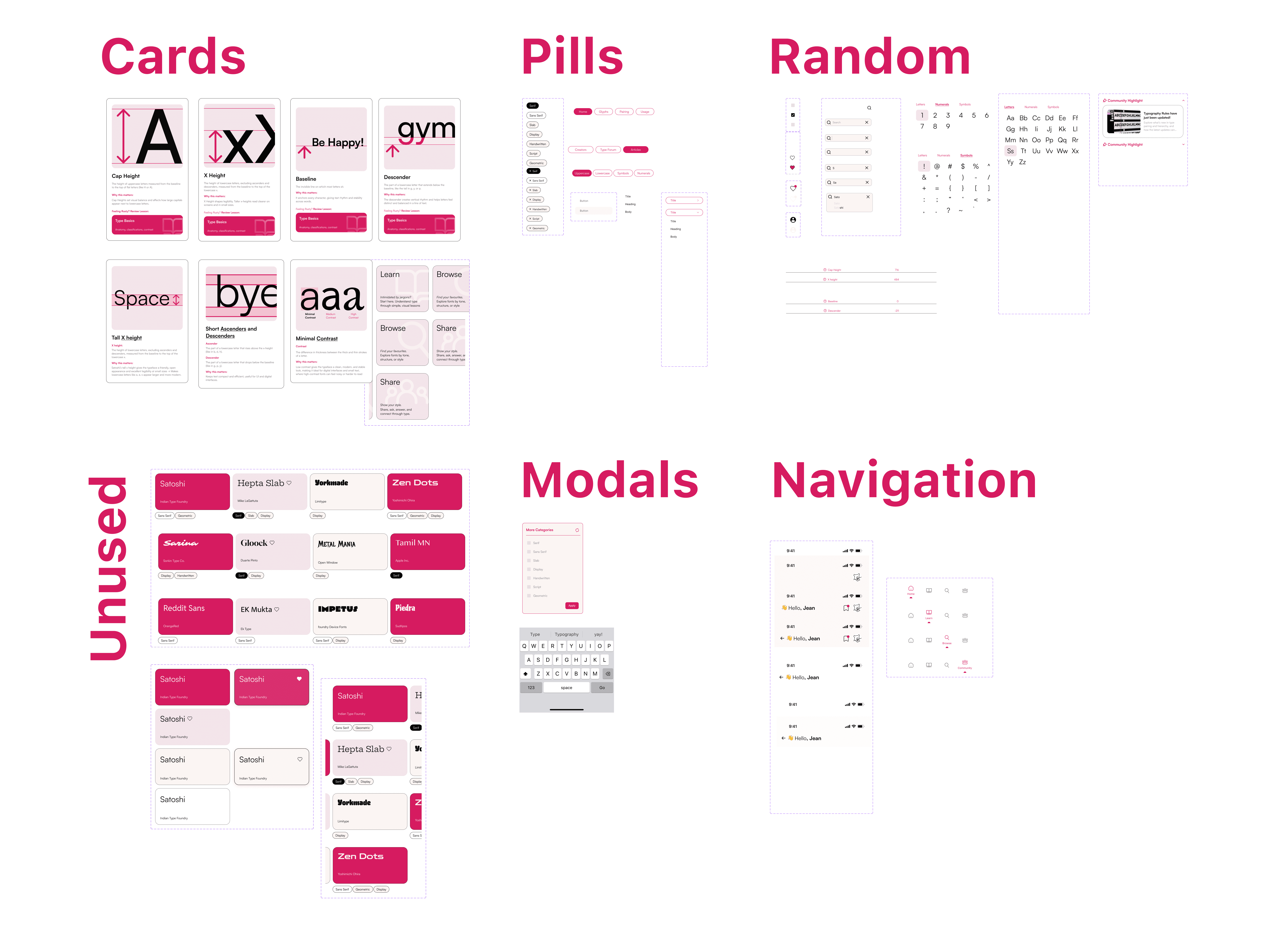
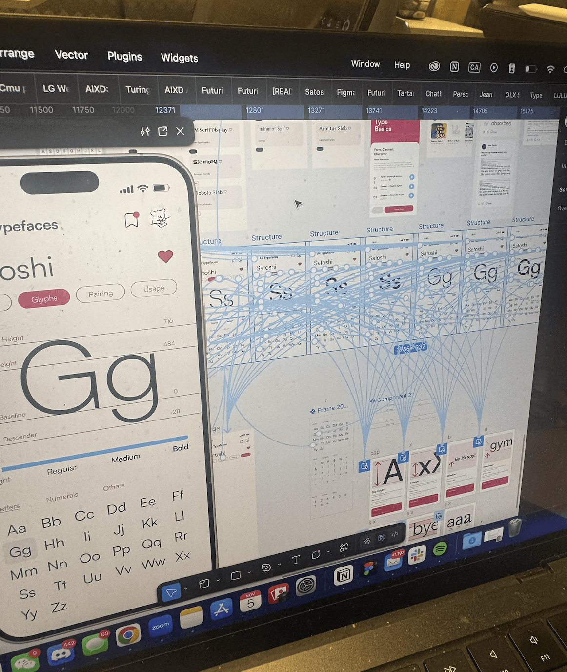
04 Prototyping & Interaction Design
Features Flow

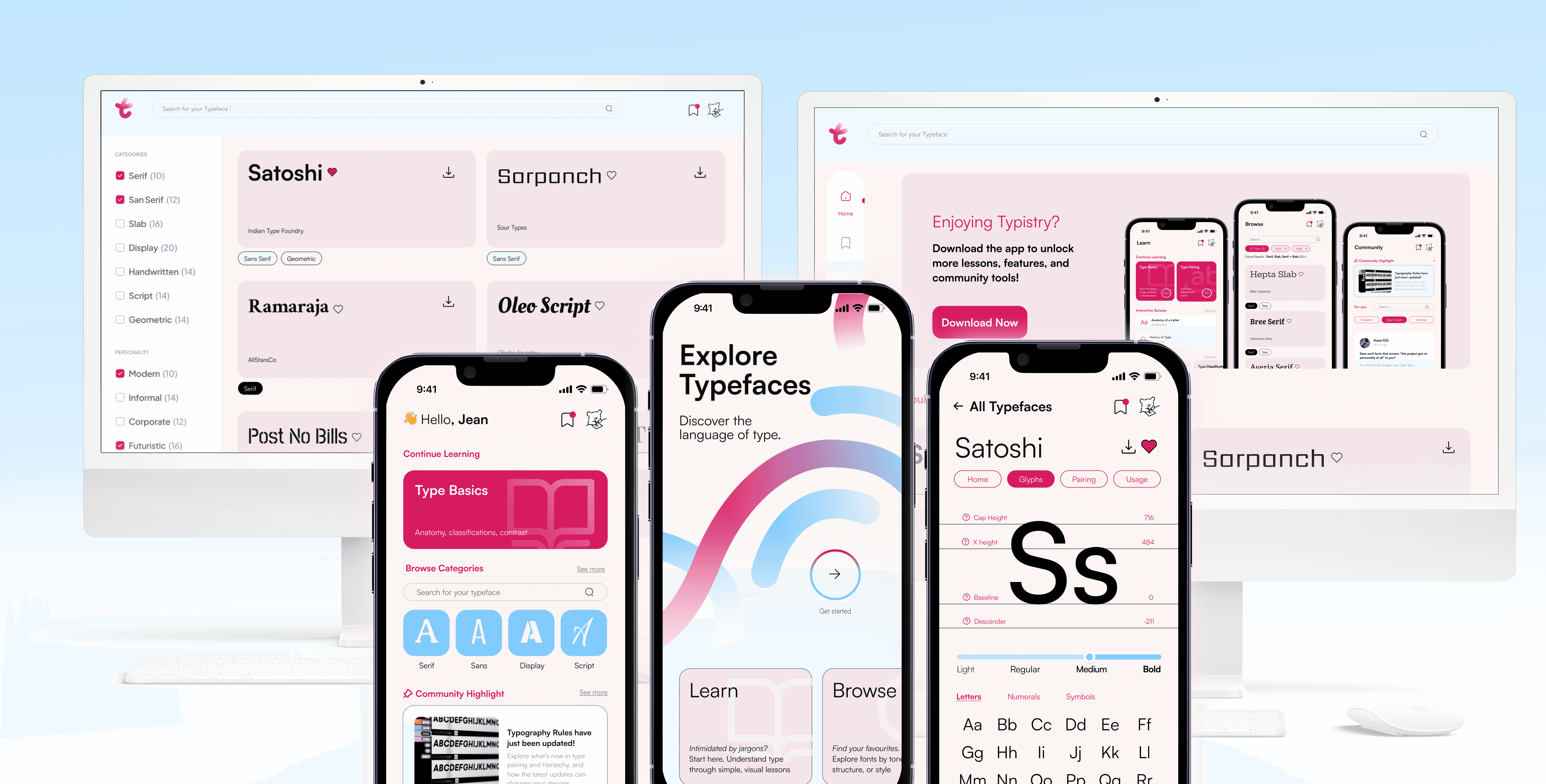
The first prototype combined all essential app interactions into a vertical flow(lean, browse, community). Users could enter through onboarding, continue lessons, browse typefaces, and explore community content without friction.
Typeface flow

A dedicated Typeface Flow simulated the experience of browsing and experimenting with fonts. Users could view full character sets, compare weights, see Type used cases, etc.
Finals

04 Reflection
Key Takeaways
Key Insights
Reframing Is the Real Design Work
Always ask "why"
Systems Enable Play
Designing components as a system revealed how structure creates space for flexibility and exploration.
Grateful for…
As I wrapped up Typistry, I started thinking about how much of this project couldn’t have been replaced by a tool or shortcut. It made me realize how human design really is, because of the questions we ask. From the start, reframing the brief became the most important part of my process. What began as a straightforward type specimen project became something much more personal and intentional. Instead of building a place to display fonts, I wanted to design a way for people to learn, notice, and connect with type. That shift only happened because I kept asking “why.” Why does this app need to exist? Why would someone explore type on their phone? Why not make it something playful, something that teaches?
Working through Typistry also reminded me how design is really about empathy and accessibility. The color palette wasn’t simply about looking nice but also about making sure users could focus, read comfortably, and feel guided without distraction. Thinking about accessibility, AA and AAA contrast checks, hierarchy, and type sizing, changed how I saw my own work. It wasn’t just “good design practice” but a way of caring for the people who would use this.
Building the component system taught me to think less about isolated screens and more about systems and how every change ripples across an interface. Each component in Typistry was like a building block in a larger language. It made me appreciate how structured and fluid design has to be at the same time: grounded in rules, but open to play.
And perhaps the most important lesson i will take away form this project is that design isn’t the final product but rather an ongoing conversation. Between user and interface, between designer and system, between history and technology. In exploring how typography could teach through motion and play, I rediscovered my own reason for designing in the first place. It’s to build playful but functional systems and experiences that make people notice; to help them see, learn, and feel something through something even as mundane as a typeface specimen app. This process made me realize how deeply I value reframing, curiosity, and the human side of systems. In a world where design can be automated, this project grounded me with passion, questioning, and emotion that matter so much to me.
bloopers