MiaoTea
Shipped Brand System
Visual Identity & Brand System for a Place-Rooted Boba & Tea Chain
Role
Brand Systems Designer
Timeline
3 weeks, Winter 2025
Tools
Figma, Illustrator, Photoshop
Team
Sole Designer
AT A GLANCE
Designing a Place-Driven Brand System
01 End-to-End Ownership
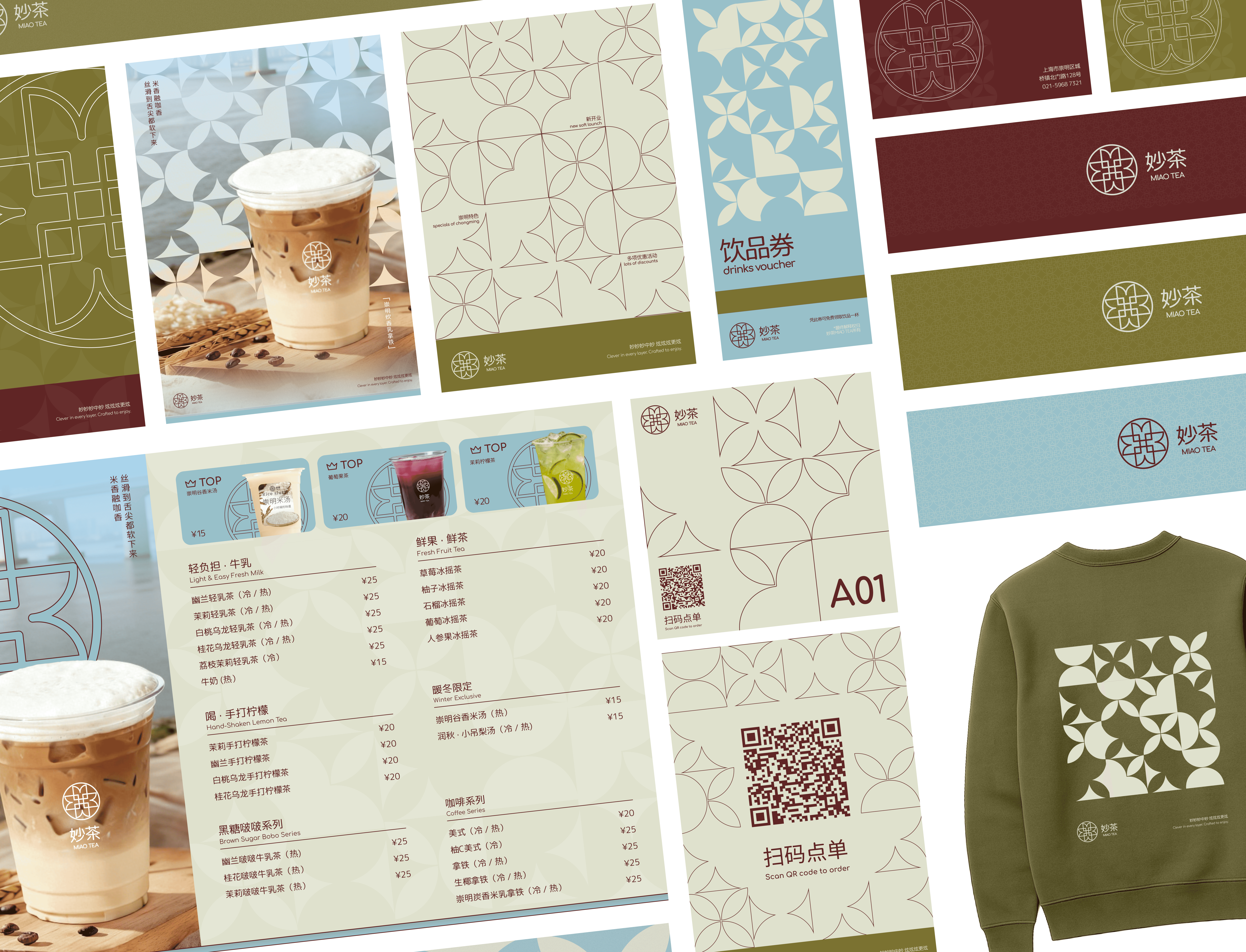
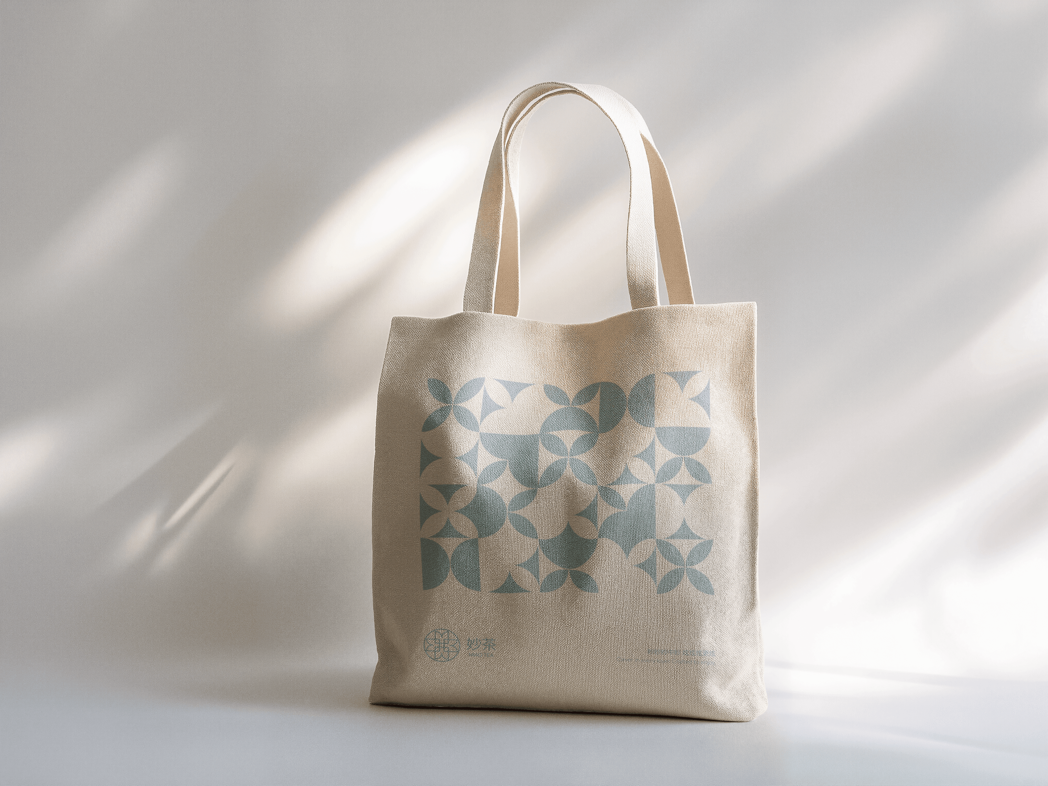
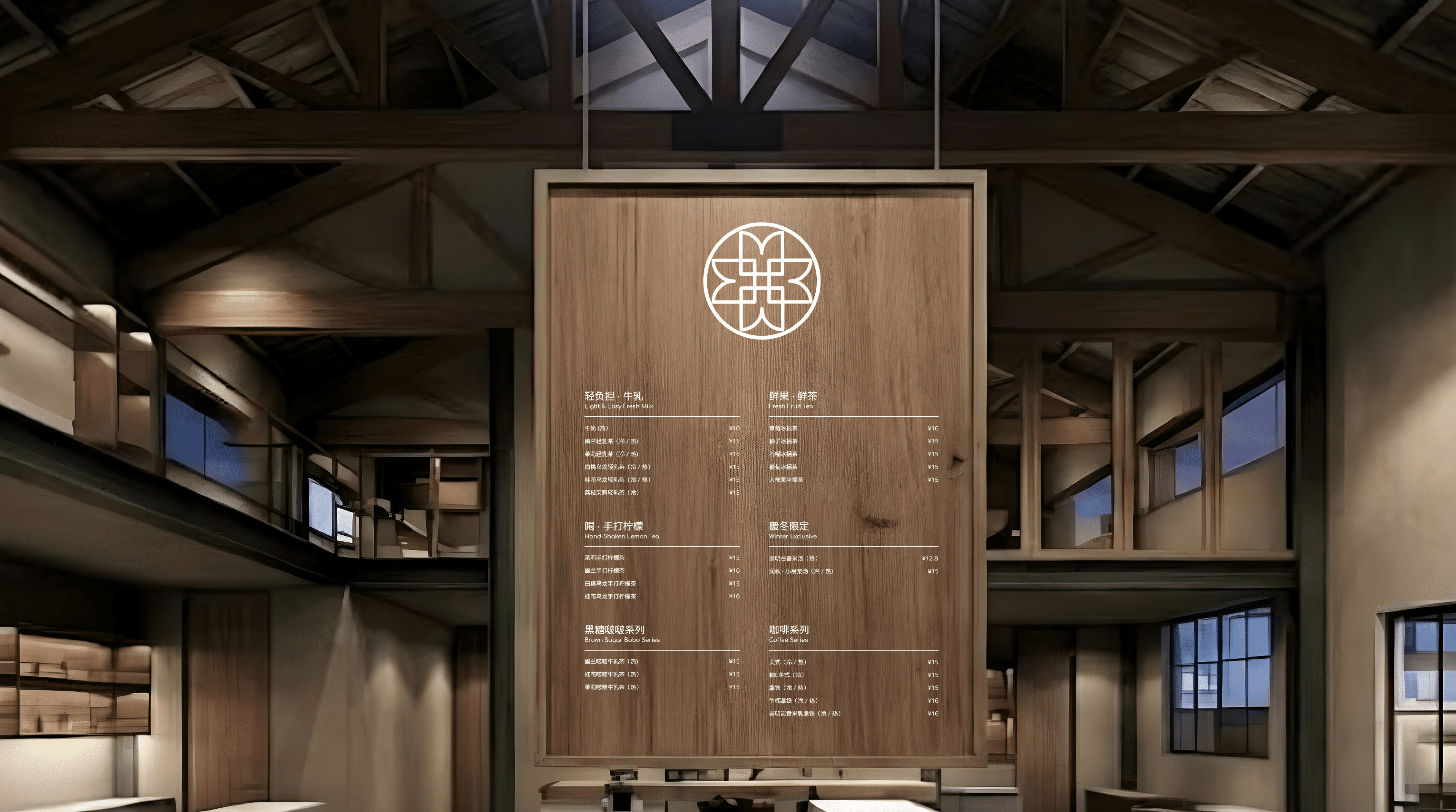
Led the complete visual identity from concept to production, designing the logo system, color palette, typography, and physical brand assets including cups, bags, and posters.
02 Culture & Place as Strategy
Grounded the brand in Chongming, Shanghai, translating cultural context and local atmosphere into a warm, restrained visual language.
03 Real-World Application
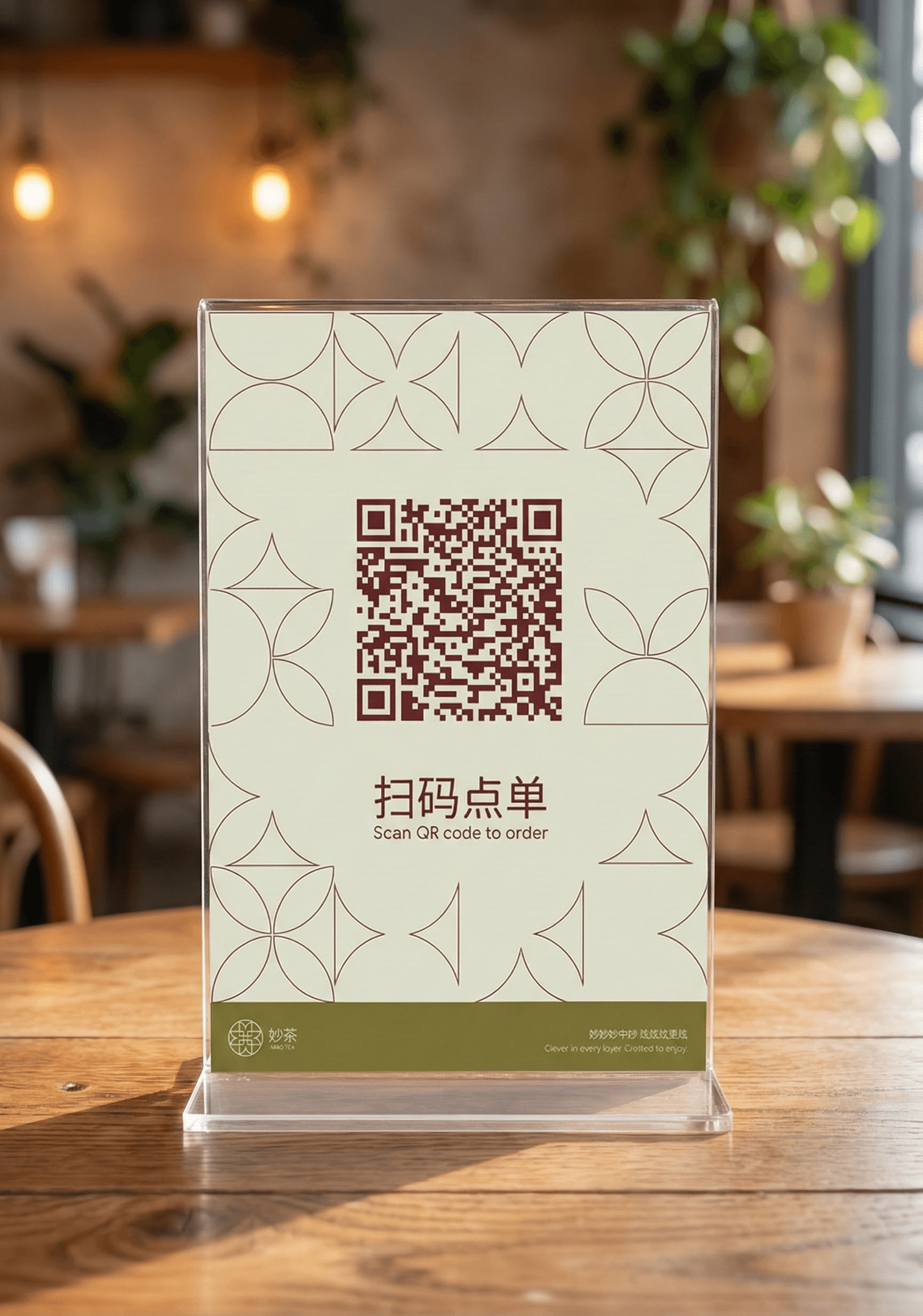
Delivered a scalable, production-ready system, collaborating directly with the client and manufacturers to ensure brand consistency across print and in-store materials.
Context
MIAOTEA is a boba and tea brand rooted in Chongming, Shanghai, a quieter, more residential area distinct from the city’s dense urban core. The brand draws from the region’s calm rhythms, open landscapes, and everyday rituals of tea, offering a more grounded and reflective alternative to high-energy bubble tea chains.
This project was especially meaningful to me: Chongming is my mother’s hometown, and a place I visited often growing up. When I was commissioned to design MIAOTEA’s brand identity, I was excited to translate a deeply personal understanding of place into a thoughtful visual system.
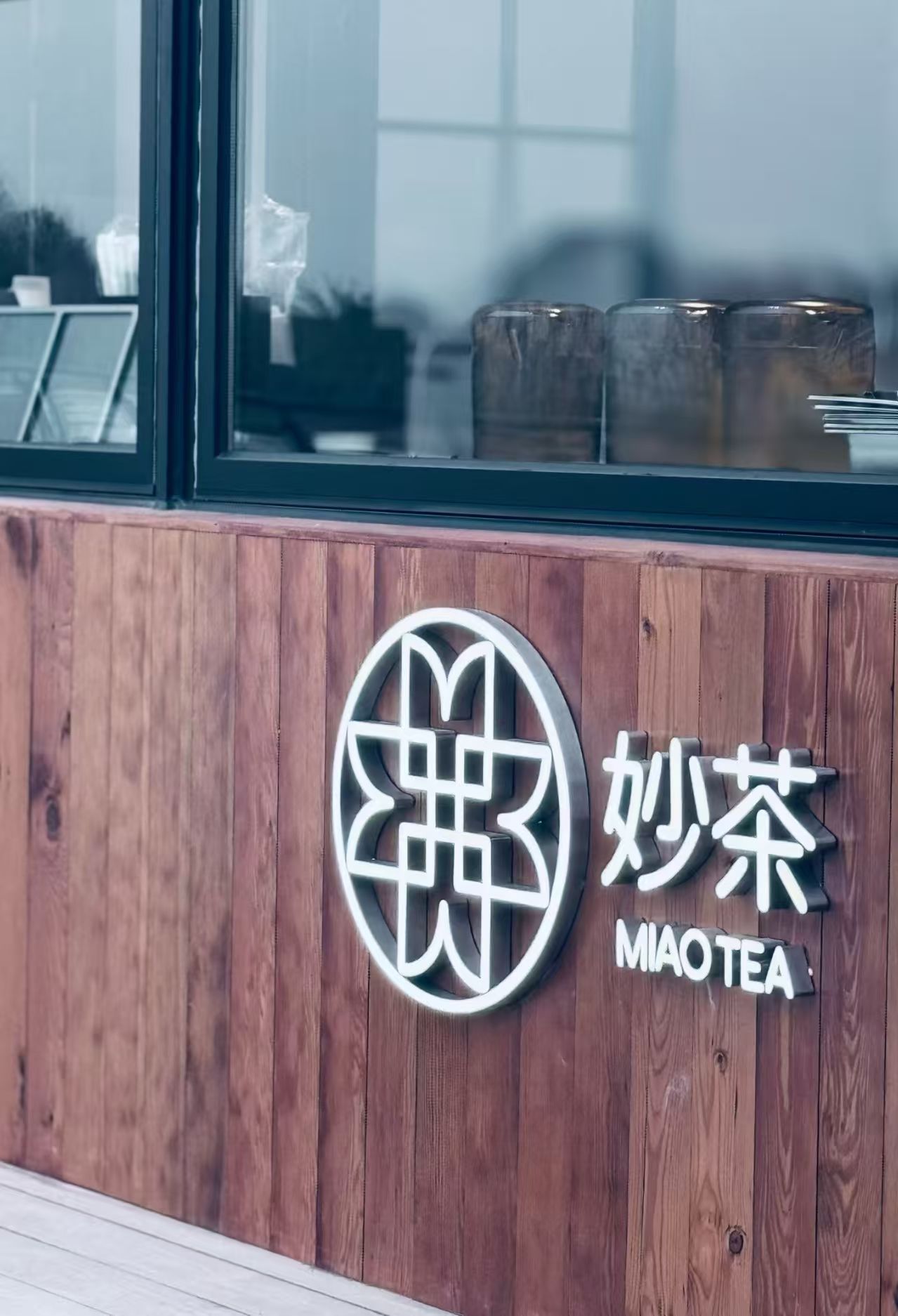
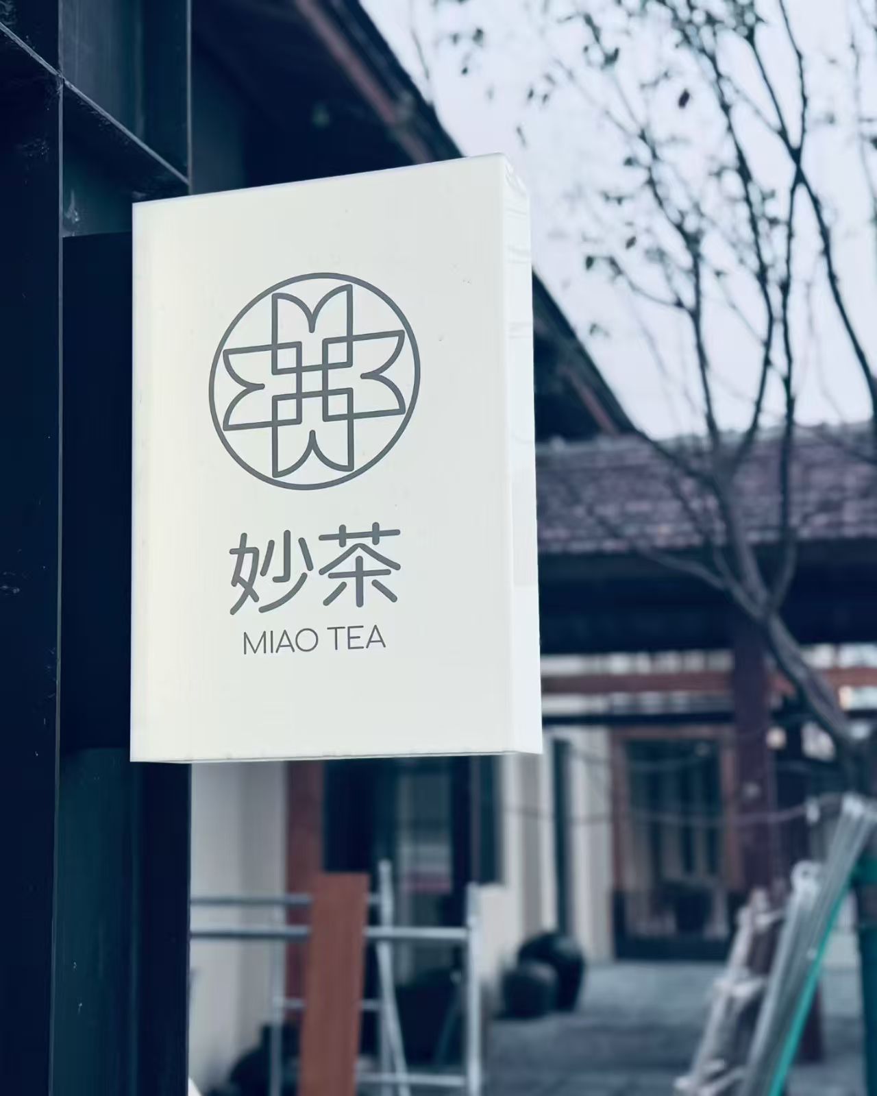
The branding draws from both local culture and the existing architecture of the storefront, using form, proportion, and restraint to reflect the environment. I worked closely with the client through direct interviews and ongoing conversations to align on vision, values, and tone, and coordinated with manufacturers to ensure the system translated accurately into physical materials. The result is a calm, place-anchored brand identity that feels authentic to Chongming while remaining clear, contemporary, and adaptable across packaging, signage, and promotional assets.


Brand System
Consistent, place based, yet contemporary,

Logo + Icon creation process
Colours

Reflection
What I learned from this fast paced solo brand project
Key Insights
Small Forms Can Scale Into Systems
I learned how a single, simple form, like the “M” from the logo, can act as a modular building block, expanding into patterns, layouts, and visual motifs that carry consistency across an entire brand system.
Design Is Proven in Production
Implementing the brand beyond screens taught me how design decisions hold up in the real world, from preparing correct print file formats and specifications to communicating directly with manufacturers to ensure color, scale, and material fidelity.
Grateful for…
This project gave me the opportunity to lead a full-scale brand system from concept through production as a sole designer, and it became a meaningful point of growth in my practice. Designing for Chongming — my mother’s hometown and a place I visited often growing up — grounded the work in lived experience and shaped every decision with care, restraint, and respect for place.
Beyond visual exploration, I deepened my understanding of how brands are realized through implementation. Translating a modular system into physical assets required careful attention to print specifications, file formats, and material constraints, as well as direct communication with manufacturers to ensure the brand was executed faithfully in the real world. Seeing the system move from screen to production reinforced how much responsibility designers carry beyond aesthetics.
I’m grateful for the trust placed in me throughout this process and for the chance to strengthen my judgment as a designer, learning how simple forms can scale into cohesive systems when paired with thoughtful execution, collaboration, and cultural sensitivity.